We’re delighted to launch the new UI of our Marker.io dashboard today, after working on it for 2 months!
We changed a whopping 14,935 lines of code, mainly related to navigation and destination settings. We also merged Guest and Member feedback.
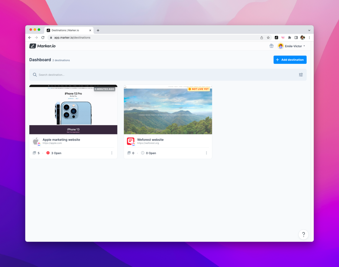
App navigation
The primary account navigation has moved from the left to the top of your screen. From there, you can view your personal and workspace settings.
Destination navigation
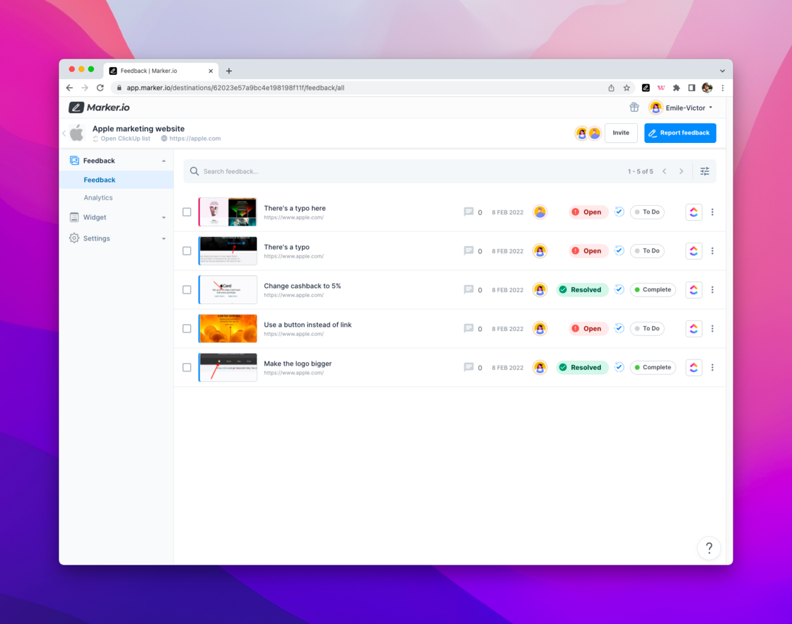
Within each destination, we now have 3 defined sections on the left hand menu: Feedback, Widget, and Settings.
Merge of Guests and Members feedback
Feedback from Guests and Members now appears under one common list. Comments and statuses have also been added to the Members’ feedback, making it easier than ever to manage feedback.